Calendar Enhancement
Initiative
Summary: As a product designer at Hearsay, I was working on the Social product, a distributed, compliant platform for professionals working in highly regulated industries. During this time, I led the research and design for the Calendar Enhancement initiative. The project aimed to transform the social media calendar from a viewing tool into an actionable and accessible feature for content management for users using in regulated, financial fields. The enhancement resulted in around 30% overall page usage improvement. This effort was a key step toward a future-proof, unified omni-channel flow.
My Role: With an approach rooted in the Double Diamond model, I led the research efforts, designed a complex end-to-end flow, prioritized key improvements with my team and successfully supported the implementation of the project and its future iterations.
Team: I was part of a three-legged chair EPD team (Engineering, Product, Design) working with a Product Manager and an Engineering Manager. I also collaborated with a mobile designer to bring a related time management tool the mobile app.
Project Description
The goal of the project was to streamline and enhance the user experience in organizing content within a social content handling tool. This involves consolidating the flow of tasks to support the number of actions users needs to take, improving the ability to organize content, and simplifying the post creation process.
Kick-off workshop
Research
Synthesis results
Problem statements
Ideation workshop
Potential solutions
Prototype
Usability test
Deliver
Measurements
Related features

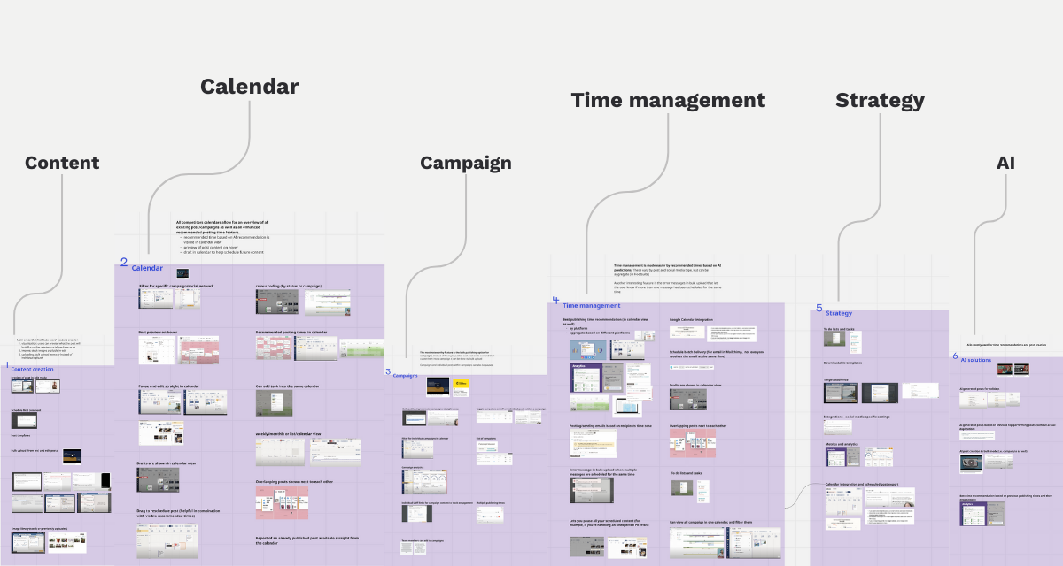
Click on the title of a section of the process diagram to navigate directly to that area.
The Learning Journey
First steps of discovery was to gather what we know of the as-is design, based on customer calls, and support tickets. The hypothesis was: while the users recognized the value of a content calendar, the tool itself was outdated.
Being in the middle of a problem space my approach was rooted in the Double Diamond model, combining qualitative and quantitative research to ensure every design decision was data-backed and user-centric. I started to dig deeper to find the root cause and the why?’s behind the pain-points.
Kick-off Workshop
We kicked off the project with a Discovery Workshop. This workshop involved a cross-functional team of Product Managers, Engineers, and other stakeholders. The agenda was planned to share insights, historical knowledge and define hypothesis from multiple perspectives for our product and an omni-channel flow web & mobile.


Research
To create a cohesive understanding of the user problems, first I had to create a research plan, which I conducted parallel for efficiency. With the support of product prioritization, I was able to gather learnings from the following three approach, before entering the solution space:
Qualitative Interviews
I conducted interviews with eleven financial advisors and agents to understand their daily workflows and pain points. I learned they relied heavily on calendars for content management, at the same time seven out of eleven participants haven’t realised that the tool had a filtering option. I also heard their frustration with the problem of the navigation issues between the calendar and the post library and the lack of clarity between different content types.
Quantitative Data Analysis
Quantitative data from Heap and Snowflakes (data tools) validated our qualitative findings. The data was eye-opening: there was a 0.00% conversion rate for users attempting to reschedule a post from the calendar, indicating a complete failure in the user flow: the reschedule/unscheduled options were hidden. Data also validated the usability issues related to filtering. This provided proof that a redesign wasn’t just a “nice-to-have” but an absolute necessity, so we went on.
Competitor Evaluation
Our research into the Calendar revealed that competitors like Hootsuite and Seismic LiveSocial have integrated features that drive a more seamless user experience. These platforms offer integrated functionality, allowing users to manage posts with drag-and-drop actions directly within the calendar view, where they have actionable recommendations for best time to post and content scheduling. This informed our strategy to innovate by providing a more modern, intuitive, and feature-rich calendar that addresses our users’ core needs and closes the gap with competitor offerings. The discovery’s outcome focused on 6 main categories.
Problem
It was time for me to process the learnings. I synthesised the research insights and related support tickets to help define problem statements.
The key problems identified:

Fragmented Workflows
Users cannot completed actions efficiently due to fragmented navigation and lack of guidance. Data showed that the calendar seemed like a passive viewing tool with high signs of frustration (e.g., rage-clicks).

Poor Content Clarity
Users cannot easily organize or distinguish between campaigns and individual posts in the calendar. The confusing color-coding and lack of campaign-level filtering make it difficult for them to manage posts.
Limited Functionality
Users were frustrated by cumbersome posting workflows, critical actions like creation and unscheduling were hard to find, resulting in low adoption and over half of interview participants unable to complete the task.
Ideation
Entering the solution phase, I scheduled an ideation workshop, with participants of the previous round. Our goal was to reach a common understanding of user needs, collaboratively define a list of prioritized features and a plan for execution. This workshop ensured everyone was on the same page and that our solutions were technically feasible and aligned with business goals. The Calendar Enhancement project was framed as a series of “How might we…” questions to help guide our efforts and ensure our proposed solutions addressed the above mentioned problems.
Potential solutions
With a clear, data-backed understanding of the problem, I framed our design goals around making the calendar more accessible and actionable.
I focused on creating intuitive interactions, allowing users to create, reschedule and delete posts directly from the calendar view and maintaining the highly requested drag-and-drop functionality. The visual design was also enhanced with new post card designs, clear status indicators and distinct visual cues for different content types.
A key improvement was the filtering system overhaul, which gives users control over their calendar view. They can now filter by campaign, post, or network type, as well as status, which makes it easier to find relevant content. The design also contains a selector between single and campaign posts.
To proactively guide users and reduce friction, I designed an action card that appears in the calendar’s new empty state and after two consecutive weeks without scheduled content. This card provides clear calls to action for main content source options and navigation between pages.

Implementation
I worked with our Product Manager and Data team to set measurable goals, while iterating quickly in an agile setup. A key challenge was integrating a third-party calendar provider. To address its limitations in time, I collaborated closely with the Tech Lead to adapt within Hearsay’s design system, ensuring consistency and avoiding one-off or hacky solutions.
Prototypes
When I switched from quick paper wireframes to Figma designs, I built the prototypes for the three main user flows:
1. Schedule Campaign Content: user subscribing to and managing a ready-made, compliant social media campaign.
2. Schedule Curated Content: user picking compliant content from post library and manage it in calendar.
3. Manage Original Content: user handling content made by them.
Prototype of Manage Original Content user flow
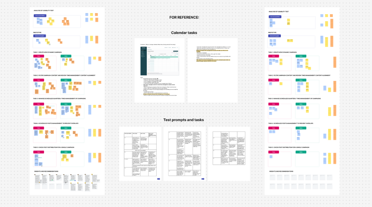
Usability Test
The test plan focused on unmoderated testing of core tasks like separating individual and campaign posts, filtering content, and managing overlaps. The goal was to identify the most important visual elements and features, and to understand how users approach content management within the calendar. The test has been done for all three prototypes.
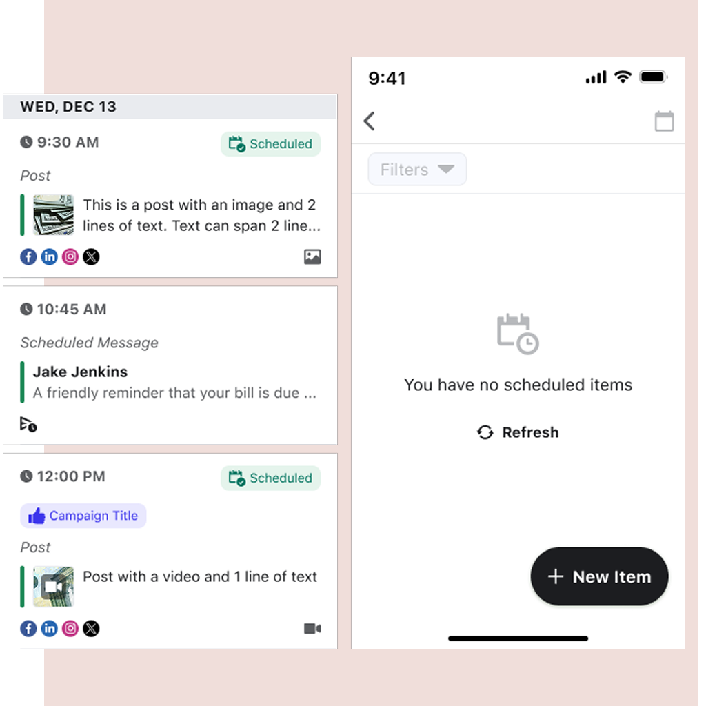
One key result was the success of the action card (left video), introduced as guidance for onboarding and empty states: if the calendar stayed empty for two weeks, the card appeared with navigation options. This solution not only performed best in user testing but also achieved the highest adoption rate six months after release.
Deliver
Through close design-engineering syncs and continuous iteration, we delivered not only a facelift, but a more usable feature, that balanced usability, technical constraints, and system compliance. The outcome met business goals while remaining scalable and aligned with our design standards.
Outcome
The teamwork paid off: within a year, overall page usage improved by over 30%, and users actively engaged with features like filtering and rescheduling. The adoption rate of the action card for the user’s onboarding flow showed high numbers.
And the team didn’t stop there. Building on the same research and workshop ideas, we made the process of implementing features faster and delivered several related roadmap items to improve users’ time management and overall experience.
Timeline View for Mobile
I synced with our mobile designer to bring a timeline view to the Hearsay Mobile app, providing a more organized and digestible way to see upcoming posts on the go.

Smart-Scheduling
My team developed and implemented a smart-scheduling feature that provides time recommendations for posting.

Upcoming Post Reminder
We introduced out-app notifications to alert users about upcoming posts that need their attention. This ensures that users to take timely action.
Reflection
This project reinforced my belief that an adaptive and collaborative mindset is key to navigating challenges. First, our user-centered and data-informed problem statements gave us a clear mandate and a way to prove the impact of our work. Second, it highlighted the importance of cross-functional collaboration. By involving our engineering and product partners from the very beginning, we ensured our solutions were not only desirable and feasible but also truly addressed a core business need.